
Page 43 - index
P. 43
the better,” says Watkin. “Information about where it came from and ways to use it are beneficial.”
Sometimes the material used in the package conveys a subliminal message about the company and the product.
“Paper laminate gives the package an earthy feel,” says Schur. “It gives it a more organic feel on the shelf. There are a lot of opportunities in the way of printing on paper laminate.”
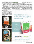
The Sambrailo paper-based packages, are designed to give organic consumers in partic- ular an earth-friendly feel.
“We invite produce companies to think of ways to communicate their message via packaging,” says Bradford. “We invite produce companies to challenge packaging producers to come up with solutions to your marketing ideas. Be innovative. Be a leader in the industry.”
CONSISTENCY MATTERS
The look of the package should become familiar over time because it conveys a trusted brand. “Aesthetics and the way a package presents to the consumer is generally consis- tent with a brand,” says Bradford. “While we see little to no change in logos and the attempt to maintain brand recognition, the font, images, colors, etc., are targeted to the buying audience and the product.”
In order to build long-term brand identity, the look of the package should be consistent
with the graphics on the company’s other messaging.
“Labels should always complement the brand’s packaging and other marketing materials,” says Yerecic. “Many times, we do label mock-ups on the clamshell or finished package, so the customer can see how the label design complements or takes away from the product. This is even more important in produce as visibility of the product is one of the top customer desires. We have seen many clear labels or labels with viewing windows in
PHOTOS COURTESY OF YERECIC
PRODUCE BUSINESS / AUGUST 2018 / 43
