
Page 67 - index
P. 67
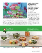
                  Grape tomato packaging comes in all shapes and sizes, but this honeycomb clamshell from Big Taste and BC Hot House Foods featured at the Canadian Produce Marketing Association conference in Vancouver was an eye-opener.
“Beyond artwork design, our concern is print quality. We want to ensure whatever the color or design, all printing is executed properly and consistently.”
—Ryan Talag, Chantler Packaging
represent a poor quality product or a grower who doesn’t care about the details.”
Whatever the colors, high-quality graphics make a statement about the product and the store that is worth the investment.
“ e graphics are important,” says Schur of Schur Packaging Systems. “ e quality of the print and of the seal, the overall quality of the package matters.”
 e look of the package may vary with the product, which can impact both the impor- tance of visibility and the requirements to extend shelf life.
color of the packaging and the produce item it displays.
“We have clients who use a variety of colors,” says Chantler Packaging’s Talag. “Usually the artwork is designed to work well with the product, like using a red for
tomatoes or blue to represent fresh watery cucumber. Beyond artwork design, our concern is print quality. We want to ensure whatever the color or design, all printing is executed properly and consistently. If a bag looks faded or the printing is sloppy, it can
 PRODUCE BUSINESS / OCTOBER 2018 / 67
